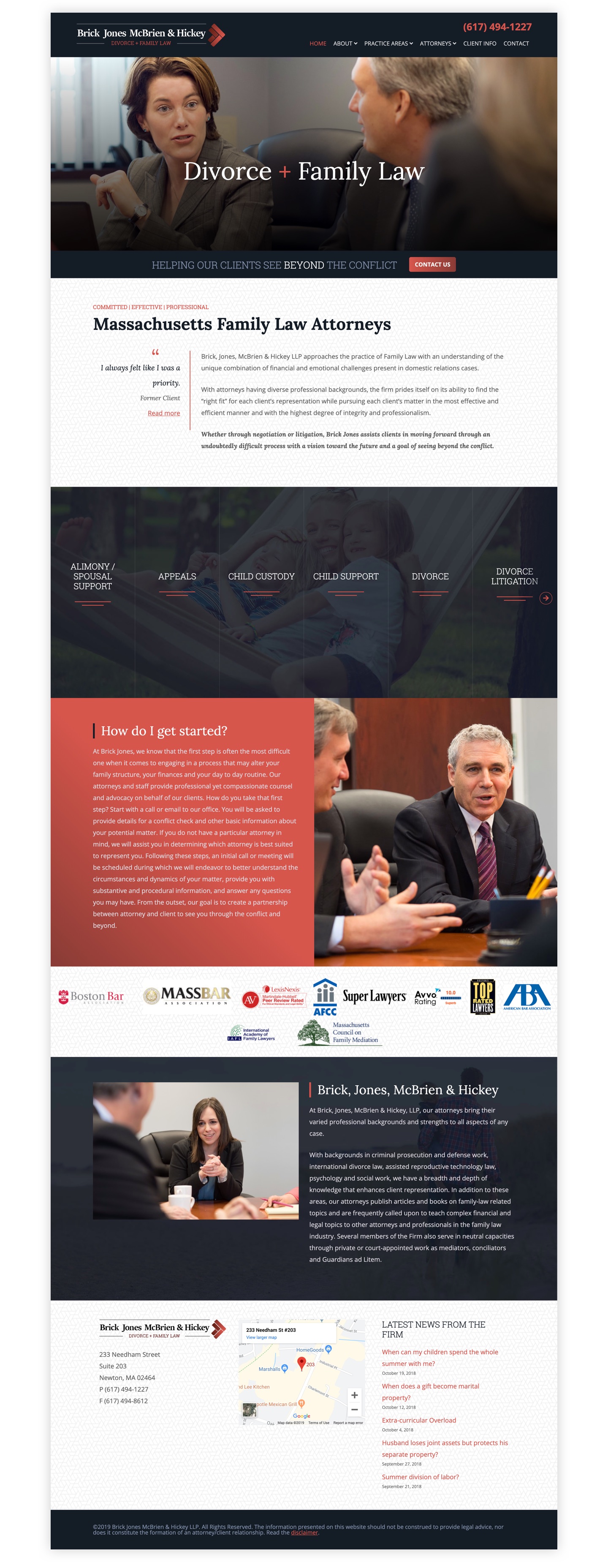
Brick, Jones, McBrien & Hickey LLP “Brick Jones” approaches the practice of Family Law with an understanding of the unique combination of financial and emotional challenges present in domestic relations cases. With attorneys having diverse professional backgrounds, the firm prides itself on its ability to find the “right fit” for each client’s representation while pursuing each client’s matter in the most effective and efficient manner and with the highest degree of integrity and professionalism.
Logo
Prior to the family law firm rebrand, their logo was uninspired and the website was not representative of the firm’s stature. We wanted to give the user a better sense of what it’s like to work with Brick Jones. Early on it was clear that new assets had to be created so a photo shoot was scheduled. After the art direction was communicated to the photographer, work began on the logo. We wanted to play off the word brick. The solution was the classic herringbone pattern, which leads the way to a respectful resolution.
The branding process involved exploring several directions that could capture the firm’s identity. We wanted to convey stability, trust, and a sense of tradition without feeling stiff or corporate. The attorneys at Brick Jones are known for their personal approach to family law, and the brand needed to reflect that warmth.
The herringbone pattern became the firm’s visual signature, appearing across business cards, letterhead, and the website, creating a cohesive brand system that extends well beyond the logo itself.


The light and dark versions of the final logo.
Color Palette
Typography
Website
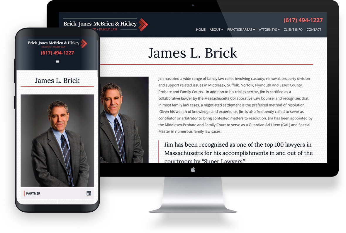
The new law firm website design is informative and user-friendly while capturing the characteristics of the firm. The content and architecture of the site were re-worked to simplify the user’s way finding experience. The firm’s practice areas are prominently displayed on the homepage and are easily accessible from the menu. Clear calls to action generate leads and the firm continues to gain traction.
Responsive
